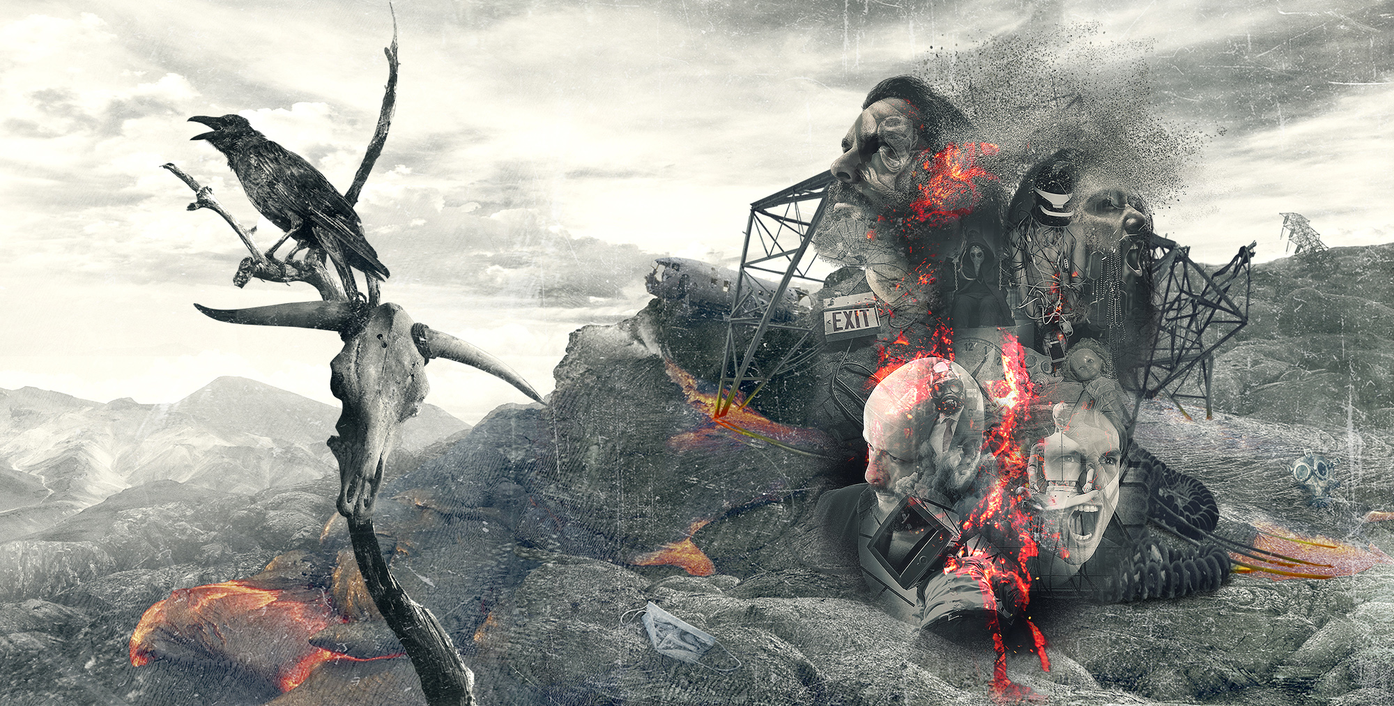
The world is really gone as we know it, but we still believe
This year we were invited to bring a visual solution for the new album of the rock band Cleaver. The name of the album was extremely strong: “The World is Gone” and the brief was also based on concepts like the ‘end of times, but we still believe in a chance to survival for mankind’. Also needed to show all we left behind, our memories, families or past hopes, but with a strong belief in the future.
The huge challenge was obviously bring a non obvious visual language to life, because we had to provoke a strong sensations but also to create awareness and make people think about the importance of what we do as individuals that are part of a species.
On the other hand, this new Cleaver album will be the starting point for an USA tour of the band, so we had the great challenge of putting our work in the major leagues.
The specific issues to solve were:
- The visual element that should define the language, the landscape or the visual concept for the entire album.
- The wow artwork cover we could develop, considering marketing on one hand but the strong album concept on the other hand. Marketing was a important issue, considering a possible US tour.
- What could be the look and feel anyone can enjoy and watch as fresh and new, considering the world music market is an extremely competitive environment and we also had a huge concept with the very name of the album.
For the visual solution we defined to work with the fire element, but used as post apocalyptic volcano scene, where all life and nature is ‘purified’ from the human influence. That’s the reason why we also used the ruined high tension towers as a symbol of the end of civilization as we know it, and the crow and the cow skull on a dead tree bring a sense of desolation to the scene.
Putting the band members heads on the cover was a communication proposal ‘cause we want to introduce the musicians to the audience considering a possible US tour, but was a real interesting decision ‘cause we could used them as base for showing memories, visual concepts and hard feelings which illustrate what we lost and left behind.
We decided to use a red temperature for the CD too, in order to give a strong alert of what we are facing as a species, but there are still more little details to watch in this work.
Hope you can enjoy watching it on the Design section as we enjoyed developing all the artwork, promotional and digital work for the release.

Recent Comments